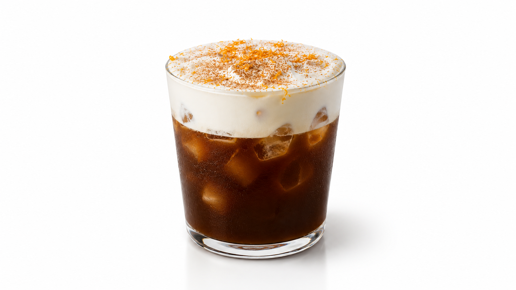
The Mont Blanc coffee
Everything below uses this recipe as the running example. Visually it gives three tones to work with: brown coffee, a pale cream layer, and a bright hit of orange zest on top — exactly the contrast that beats the trap below.
- ·1 oz fresh orange juice
- ·½ cup strong coffee, cooled to room temperature
- ·3 tbsp heavy whipping cream (regular or non-dairy)
- ·1 tbsp fresh orange juice
- ·1 tsp vanilla extract
- ·1 tsp maple syrup or simple syrup
- ·Garnish: fresh orange zest
The Flat Brown Trap
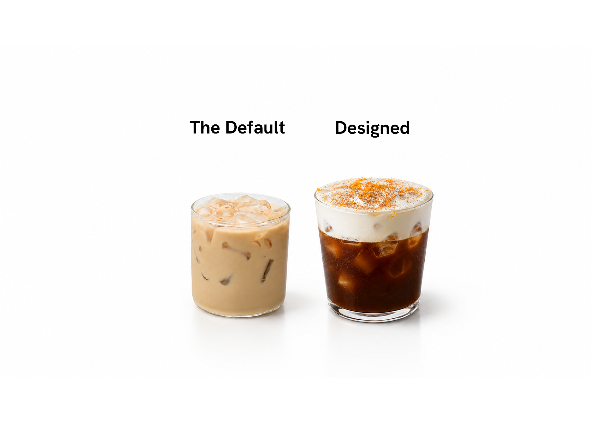
Coffee has one big visual problem: add it to almost anything and you get a flat, dull brown drink. A drink that tastes incredible but looks like every other beige latte won't get posted — the Look is what earns the click before anyone tastes it. So the visual has to be designed in, not hoped for.
Four levers, plus one step people skip
Colour
Colour is the fastest way out of the Flat Brown Trap.
Layers
Layers give the eye something to follow and make a drink look considered. This is where the texture work from Lesson 2 shows up visually.
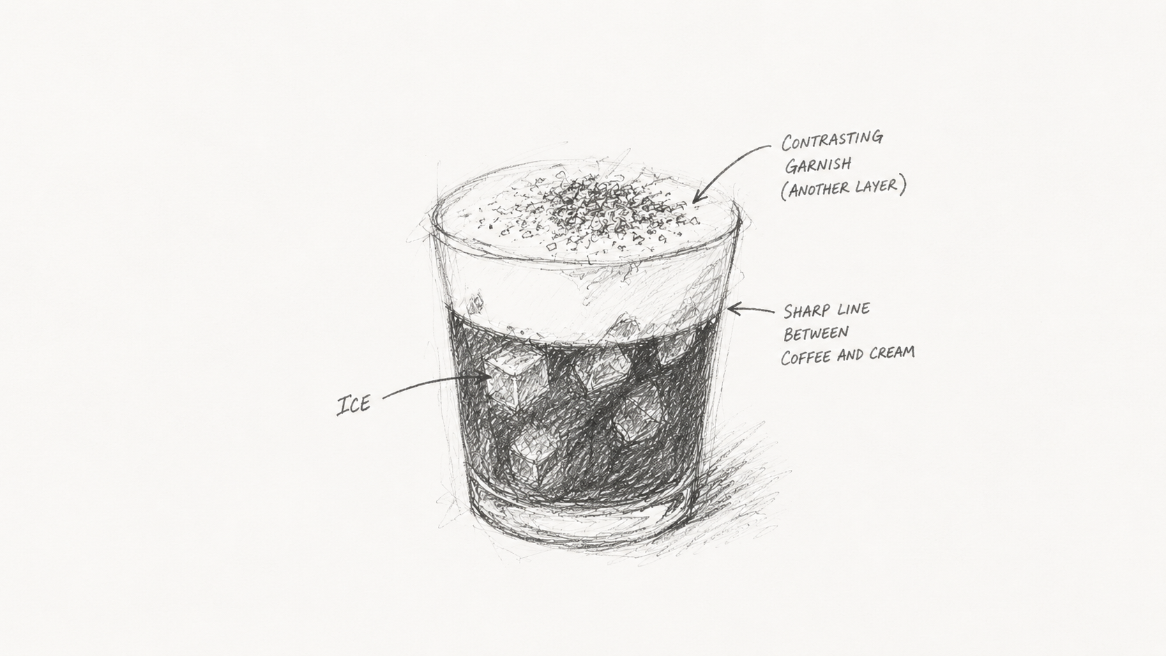
Iced serves show layers best, which is a big reason most viral drinks are cold. If you serve layered, decide how the drinker interacts with it: if it's meant to be stirred, give them a straw or stirrer.
Garnish — only if it earns its place
A garnish should do more than one job. A purely decorative garnish is clutter. Good garnish does at least one of these, ideally two:
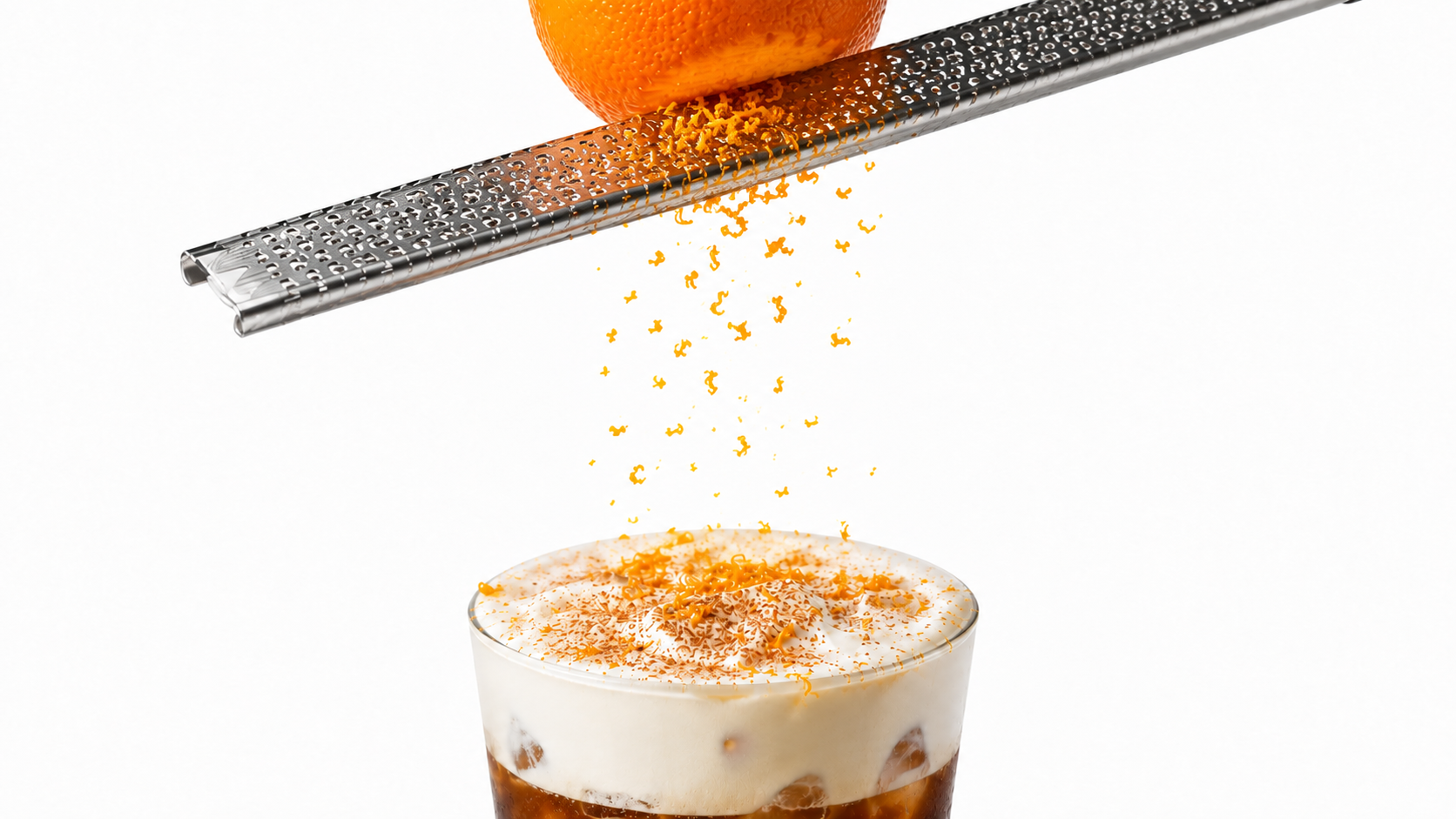
A garnish should do more than one job. This orange zest is the flavour, the pop, and the aroma.
Glassware
The vessel is the frame. It changes both the look and the taste experience.
Match the glass to the drink's mood and to what you want people to see. This Mont Blanc coffee is small and coffee-forward, so a smaller glass suits it.
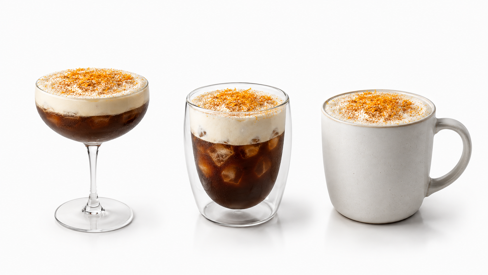
Four levers beat the brown: colour, layers, garnish, glassware.
Shoot it right
For a viral drink, the photo or video is the actual product.
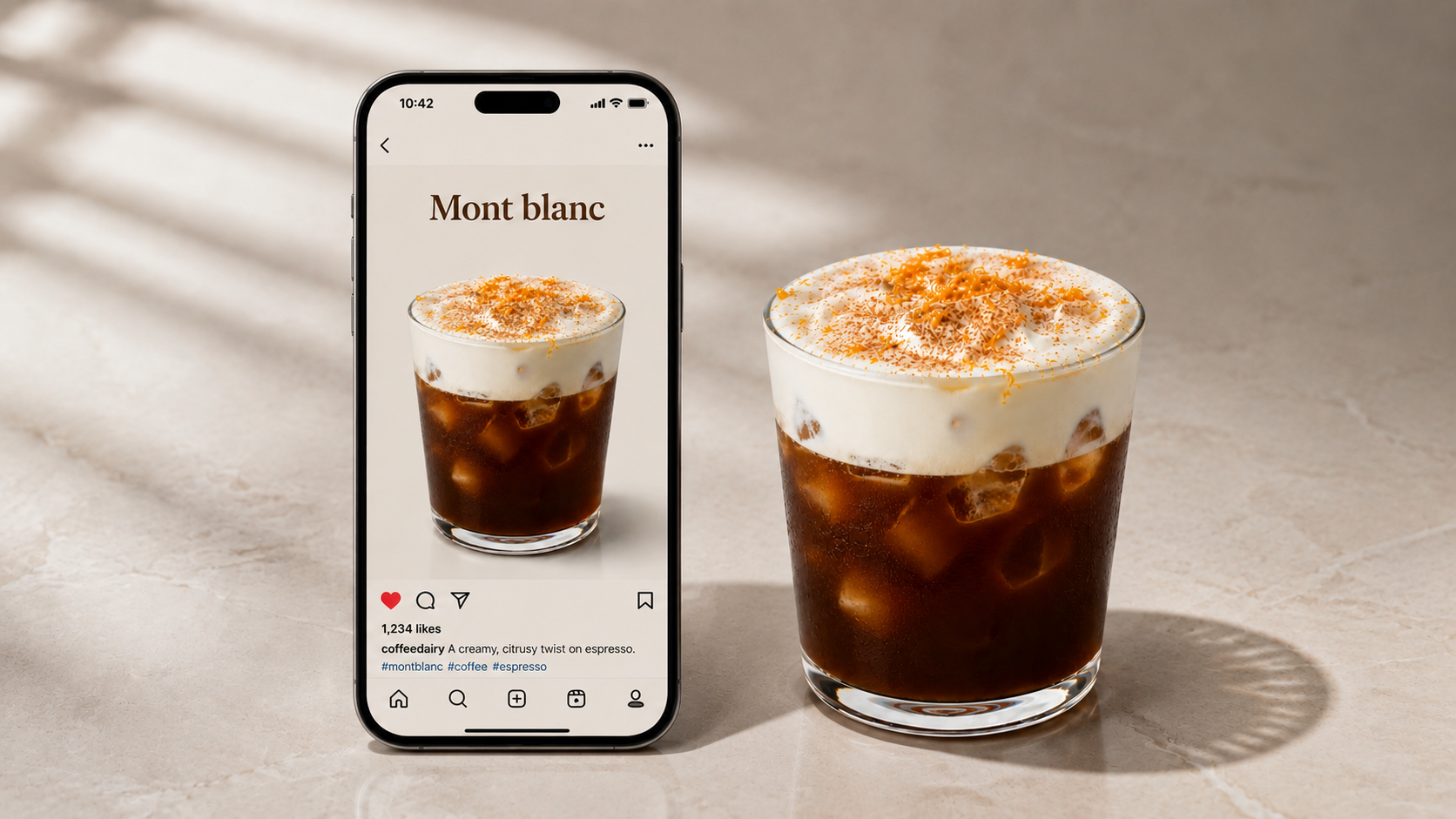
If it doesn't read at thumbnail size, it won't get the tap. Push the colour and layers harder.
Beating the Flat Brown Trap
By now the drink tastes great. The problem is that coffee has one built-in visual flaw: add it to almost anything and you're left looking at a flat, dull brown drink. Call it the Flat Brown Trap, because naming it is the first step to beating it. A drink can taste incredible and still never get posted, because the look is what earns the click before anyone tastes a thing. So the visual has to be designed in on purpose, and there are four levers to do it, plus one step people skip.
The first lever is colour, the fastest way out of the brown. Often the signature already brings it, ube is purple, matcha is green, strawberry is pink, and in our Mont Blanc coffee the orange juice and zest bring warmth against the brown coffee. Where the flavour doesn't bring colour, natural colourants will: beetroot, spirulina, butterfly pea that shifts with acidity, ube powder. The pairing of two tones meeting in the glass, pale cream over brown coffee, is a hook all on its own. The rule is simple: if the finished drink is brown top to bottom, you haven't finished designing it.
The second lever is layers, which give the eye something to follow and make a drink look considered. This is where the texture work from the last lesson becomes visible: the whipped cream floated over the coffee, an espresso over a pale latte, cold foam on top, a gradient fading through the glass. Iced serves show layers best, which is a big part of why most viral drinks are cold. If you serve something layered, decide how the drinker is meant to interact with it, and if it should be stirred, give them a straw or stirrer.
The third lever is garnish, and the rule here is strict: a garnish must earn its place by doing more than one job. A purely decorative garnish is clutter. Good garnish calls back to the flavour so the eye tells you what you'll taste, or enhances the visual, or adds aroma that changes the perceived flavour, or gives a bite that pairs with the drink. The Mont Blanc coffee's fresh orange zest is the perfect example, one garnish doing three jobs at once: it signals the orange flavour, it's the bright visual pop against the cream and coffee, and its citrus oils hit the nose before the first sip. Nothing sits there just for show.
The fourth lever is glassware, the frame around everything. The vessel changes both look and taste: a clear glass shows off the cream-over-coffee layers and the zest, a narrower top funnels aroma to the nose, a stemmed glass reads sophisticated while a tall iced glass reads refreshing, and the size sets the volume, complex coffee-forward drinks like this one look and drink better small, while lattes flex larger. Match the glass to the drink's mood and to what you want people to see.
Then the step people skip: shoot it right, because for a viral drink the photo or video is the actual product. Use the thumbnail test, does the drink read instantly at phone size in a busy feed, before anyone taps? If not, push the colour and layers harder. Shoot in natural light on a clean background, and lean on motion, the cream being floated, the zest grated over the top, the pour, because movement sells texture and stops the scroll better than a still. And shoot the build, not just the finished drink, because process footage is the most shareable thing you can make.
Put the four levers and the capture together and you've beaten the Flat Brown Trap: a drink that looks as good as it tastes, and reads in a thumbnail. That completes the build. In the next module, we find out whether it actually makes you any money.
What to remember
Test what you've learned
1. What is the "Flat Brown Trap"?
2. What are the four levers for making a drink look the part?
3. When does a garnish "earn its place"?
4. Why do most viral drinks get served iced?
5. What is the "thumbnail test"?
Optional reflection
Take your drink. Name how you'll beat the Flat Brown Trap using at least two of the four levers, and describe the one shot you'd post.